Thursday, May 12, 2011

Assignment 5 - Photography and the Environment

Two images that caught my eye from the protests again woodchipping in Tasmania:


Both images from tasmaniasforests.com.au (no photographer listed).

I chose these two images separately and only when I have put them together do I realise how similar they are in terms of mood and fogginess (I guess I am a sucker for the fog) and similar cool tones. The first one is an image that I found really showed how amazing the forest is and lets the mind imagine what the scene would be without the trees. The lower picture is more on the destruction side. Looking at this image and others like it of the trees burnt out breaks my heart. These images remind me incredibly strongly of Stromlo Forest after the 2003 bushfires, where I spend a lot of time in the forest before and after. These remind me somehow of all the pain inflicted on the inhabitants of the forest and of the sheer feeling of loss while the hills were bare. It took an awfully long time to get parts of the forest on the mend and even then the government is taking vast areas of land previously dedicated to forest in the name of "development." The topic gets me reasonably fired up so I will leave it there. But either way, this image evoked a pretty strong response.

In terms of Tim Bonyhady's When a Picture Packs a Punch, I believe he is correct in saying that the professionalism, quality, and resulting aesthetic beauty of the Dombrovskis images was indeed the reason they had such a great impact on the public. Had they been mere snapshots, I do not believe they would have had the effect of showing people the true beauty and grandeur of the Franklin River in such a way that it would make a difference to so many people. In a way these images have to evoke empathy or emotion in people to create a feeling of not wanting that thing to be destroyed. Should the item in question not be aesthetically beautiful I think there might be other ways to bring forth the same emotion. For exapmle, people photographing endangered animals tend to head more for the cute factor to create this response. Animals that are not suited to this approach either can be photographed in the state which they need saving from  - for example pigs are often photographed in their pens which are far too small, dirty, and do not even allow the pig to move at all. I suppose this is going for the pity response. In terms of forest and nature, you could follow a similar tactic (such as the logs after they have been burnt down after logging) to create a feeling of loss.

Wednesday, May 11, 2011

Assignment 4 - Narrative Photography

With this assignment I wanted to look at a reasonably fundamental, but important, difference in the way that narratives can be told through a photograph or series of photographs. The two photographers I have chosen to illustrate this are Izima Kaoru and Anne Hardy.

Izima Kaoru uses the figure of a person within the scene to tell the story. Whilst at time he relies on the set and props to help the viewer to guess what has happened, largely the figure alone is the key to understanding the narrative. You can see this approach in his "Landscapes with a Corpse" series.

Izima Kaoru
Hasagawa Kyoko wears YSL, 2003

Without the central figure, there would be nothing to suggest what had happened and there would be no real narrative. However, by careful positioning of the figure he encourages us to come to a conclusion on her manner of death and from there, perhaps, why. Whilst the background is important to give background and context to the event, he mainly tells the story through the figure. His style is very closely tied to fashion, as you may be able to tell from the fact that the title is the model's name and the clothes she is wearing. All of his photos (that I have seen so far) are of young, beautiful, dead girls and all are highly polished works that resemble the fashion style of photography. He has other works that use more of the set to tell the story but in general he seems to keep this to a minimum and restrict the narrative qualities mostly to his model.

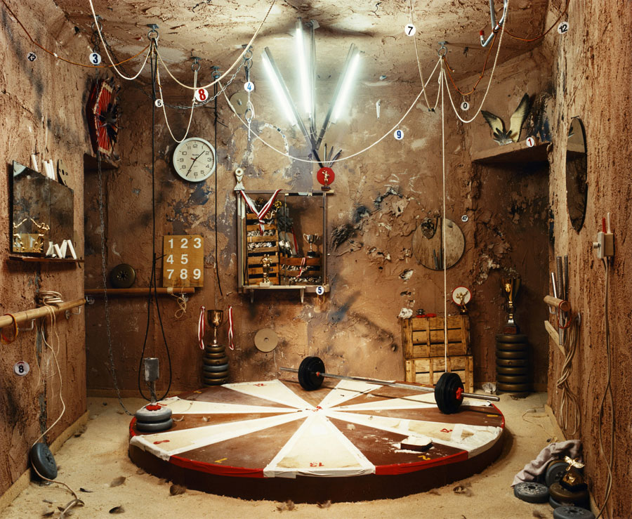
Anne Hardy takes a very different approach. He images rarely involve a character directly. However, she indicates them via the scene in her images. These scenes are exceptionally carefully constructed to suggest both a narrative/story and usually something about the character who inhabited the scene at some point.

Cipher, 2007
Anne Hardy

In Cipher, Hardy creates a scene which gave me the first impression of being an archealogical-type study due to the fact that many objects have been tagged. I suppose it could also be a forensic tag but there is no evidence of a disturbance or crime. These are just my personal thoughts on the image, but the way the scene is set it appears that the inhabitant has left, in no rush but without the inclination to tidy up. The weights and trophies scattered around indicate that the person is a champion weight lifter or athlete of some kind. There are other conclusions you can draw from the small details.

You can notice the difference between the two approaches - in Kaoru's image, the story is told by the figure and the background, while adding context, does not tell much of the narrative, while Hardy's image is almost entirely told through the background via carefully placed props and cues.


Thursday, March 3, 2011

Assignment 3: Issue of Girl Models (Bill Henson and Vogue)

Okay, here we go on thoughts and many gut feelings with my best attempts at explaining them. To me, a lot of the issues surrounding this topic come down to intention and audience. I do not truly believe that Henson is trying to create pornography, or images to create arousal, and hang them in art galleries. Perhaps he is, I can't be certain, but I don't believe so. I think his images, by and large, are more intended to make people think, debate, and get to know their own limitations and boundaries a little better. More interesting than the images themselves are our own reactions to them, and as part of the task is to respond and think about gut feelings about these images, I will try to work mostly from this.
Bill Henson
Untitled #30, 2009/2010
AH SH8 N35
archival inkjet pigment print
127 × 180cm
Edition of 5 + 2 A/Ps
Bill Henson
Untitled #16, 2009/10
AH SH4 N13
archival inkjet pigment print
127 × 180cm
Edition of 5 + 2 A/Ps

The first thing that I want to point out is that composition can play a strong role in how sexualised an image feels (to me, in the very least). The above two pictures are both extremely similar in pose. Going off gut feeling, the top one is acceptable and the latter one is not. It has a little to do with how much of the girl you can see, and a little to do with the fact that she looks younger in the lower photograph. I think the difference to me is that the first photograph is, without question, a portrait, whereas the lower image is hinting at being a nude. I say "hinting at" because I don't think it completely classifies as one, but by including her shoulder, collarbones, and hinting at the shape of her chest, the image has gained a feeling of being sexualised in a different way to the top one. It is a different thing to look at a body and a face, rather than just a face. My point in showing those images next to eachother was largely just to show how small a change is needed to change an image significantly on the scale of acceptable to not.


Bill Henson
Untitled #25, 2008/2009
AH SH21 N26
archival inkjet pigment print
127 × 180cm
Edition of 5 + 2 A/Ps

The next point I think is really relevant is that a nude can be implied and not necessarily sexualised. I think this one (above) is really in the mind of the viewer. To me, it's a portrait that doesn't really imply much of a sexual nature, but I am quite sure that if other people looked at it, this image could be highly suggestive. David Marr brings up this idea in his lecture when he asks where we draw the line. He argues that if everything that people find sexually arousing were to be removed from publication (internet and elsewhere) there wouldn't be much content  left. I once heard someone say that if you could think of something, there would be a fetish site for it on the internet, which is sadly not too far from the truth. This is not to say that some images are not, in the mainstream, seen as excessively suggestive in nature. I only mean to suggest that perhaps the line is being drawn in the wrong spot for the differentiation between acceptable and unacceptable.

That said, from a personal point of view, I have a girl who I consider to be my adopted little sister. She's 10 years old, and if I found out someone had photographed her in a way similar to any of these images, heads would roll. These girl's parents, families and friends must have been  very open minded to accept these images. I am not sure that if I was put in the same position, that I would deal very well. However, were it me being offered to be in the photographs, I believe I should have the right to choose.

Bill Henson
Untitled #11, 2009/2010
AH C SH45 N33D
archival inkjet pigment print
127 × 180cm
Edition of 5 + 2 A/Ps
Bill Henson
Untitled #23, 2009/2010
AH C SH49 N30D
archival inkjet pigment print
127 × 180cm
Edition of 5 + 2 A/Ps

The above two images, at a gut feeling level, I detest. Beyond any technical reasons I may like the photographs, they make me feel sick to the core. To me they have a feeling of violence and vulnerability that absolutely makes me furious. However, evoking an emotional response is exactly what an image is supposed to do and in that sense, to me these two images have been very successful. To me, these two come down to Henson's intention. Was it his purpose to portray these girls as vulnerable and being manhandled as a sort of perverse image, or is it to raise awareness to these issues? Once again, I can't be sure. However, just because an image makes you uncomfortable doesn't mean that you shouldn't look at it. In fact, perhaps it means it is one you should study closely. On closer examination I find these images quite threatening. It doesn't quite translate to words well but they actually get my adrenaline going, I do find them very passively aggressive and threatening, which is both why I am so drawn to them, and yet at the same time repulsed.

Vogue

My feeling is that the Vogue affair with the children dressed up as adults must be a parody (right? right? please say it is). The images don't particularly promote or sell anything, and I don't quite understand why Vogue would publish them as anything but satire. I can't really say if Vogue did or did not intend them as satire - there seems to be no clear indication either way yet.If they're satirical, then they are well done, pinpointing how completely ridiculous the fashion industry and our society in general can be. However, if it was not intended as satire, I cannot even put words on how out of line I feel that the images are. Again, this is a gut feeling. Either way, I don't understand the purpose or intention of the images if not in jest or satire.

The fact that they may have been used as satirical does not make it "okay" to photograph children in this way - but I do think it is particularly striking how similar it looks to a "normal" editorial that one might see in a Vogue magazine. As such if it is being used as satire, then it is in a sense for a good cause. The fact that people are sickened by it is then a good thing. If it was to advertise clothes, then I believe Vogue has firstly failed, and secondly crossed ethical boundaries doing so.

I do apologise if I have rambled. I think these are disjointed bits of thoughts that have built up over the night.

Monday, February 28, 2011

Assignment 2 - Ethical Photojournalism


Photo: Getty Images
New Zealand Herald, Feb 28 2011

I chose this picture as one that represented the issues raised in the readings this week for a few reasons, but mainly because it is a picture of a current event (the Christchurch earthquake), meaning that it is firstly current, and secondly, not an image we have discussed before. The issues raised in the text are ones that should be applied to all photojournalistic images. The major concern of the text was truthful portrayal of events by the media. Noone is completely objective and as such all images of this style will have part of the photographer in them and in part this is important as it can drive the photographer to take particular images. However, the text argues that to the best of the photographers abilities, they must scrutinise their work to check that it accurately shows the event, without harmful bias. The author strongly believes that this truthfulness is essential for the survival of photojournalism, as it creates a trust in viewers that the images were not posed and are showing them what actually happened. In the picture above, the photographer could have posed the people walking through the frame, or photoshopped the image to make the damage appear worse or less extreme as they saw fit. However, this would make it an 'untrue' photo in many ways and as a journalistic image this would violate the trust of the viewers and make it in some ways irrelevant.

Saturday, February 19, 2011

Assignment 1- Contemporary Photograph


Numb
Charlotte Gonzalez, 2009

I love a lot of images by this photographer (there are a few below because I have to share) but I chose this one because it is one that conveys a mood so incredibly well. I would really like my photography to a place where it can evoke emotions in viewers. I love her use of light as well: she is the master of using natural light. Well, one of them. Again, she uses the lighting to really reinforce the mood coming through in the photograph. Another thing that I appreciate about this photograph is that it is both simple and sophisticated. It is refined enough that it isn't cluttered or difficult to look at, or busy in any way, but as you continue to look at it, there are plenty of details to keep you interested. It is composed simply, but effectively (another thing I'd like to start to do with my photography), and the mist creates a beautiful feel to the photograph and almost has an effect like a wide aperture, partially obscuring the background to lend focus to the main subject, whilst reinforcing the mood of the image.


Wa
Charlotte Gonzalez, 2010


One Bored Angel
Charlotte Gonzalez, 2009


The Party Girl III
Charlotte Gonzalez, 2010

Above are a few more of her images. You can see what I mean by her beautiful use of lighting and creating a mood in her images. I will write a little about each of them at a later date.